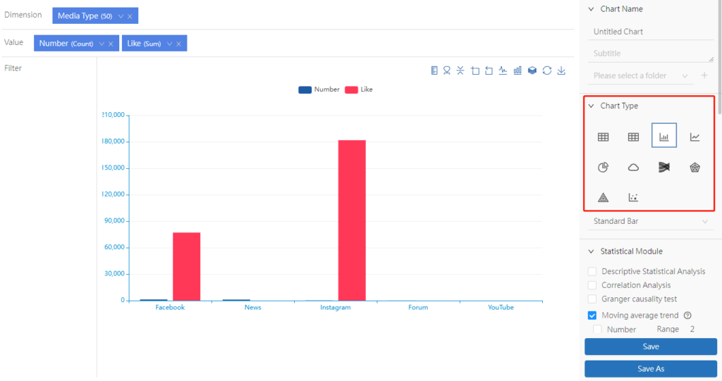
Chart types include [Table], [Cross Table], [Bar Chart], [Line Chart], [Pie Chart], [Word Cloud], [Sankey iagram], [Radar], [Heat map] and [Dot Chart]. Users can choose the corresponding chart type according to their needs. After placing the variables in the “Dimension” and “Value” fields, the data analysis results are presented in a table form by default. Select the desired chart style in the “Chart Type” on the right. Hover the mouse over a chart icon, and the chart type description will be shown.

- Table: A statistical chart composed of one or more rows to display numbers and other parameters for quick reference and analysis.
- Cross Table: a cross-table arranges two variables in the row and column dimension respectively. The intersection of the rows and columns is the data in different categories belonging to both variables.
- Bar Chart: A statistical chart that uses the height of a rectangle as a variable to describe the graph. A series of vertical stripes with different heights represent the data distribution.
- Line Chart: A line chart is a graphic formed by connecting various data points with straight-line segments, which displays the trend of data changes in a connected line. The line chart can display continuous data that changes over time (in a common scale setting).
- Pie Chart: A circular statistical chart divided into several sectors, used to describe the relative relationship between volume, frequency, or percentage. In a pie chart, the arc length of each sector is a ratio of the number it represents. Together, these sectors form a complete circle.
- Word Cloud: A type of visualization highlighting the keywords that appear frequently in the text. It displays words and phrases from small to large size to demonstrate how frequently they appear, forming a cloud-like color graphic with “keyword cloud layer” or “keyword rendering”.
- Sankey: A specific type of data flowchart. The width of the branch in the figure corresponds to the size of the dataflow.
- Radar: A radar is a graphical method of displaying multivariate data in the form of a two-dimensional chart of three or more quantitative variables on an axis starting from the same point. It is also called spider or web chart.
- Heat Map: A statistical graph that displays the relative magnitude of the dimensional data in the form of special color highlighting.
- Dot Chart: The scatter chart is a type of plot or mathematical diagram using Cartesian coordinates to display values for typically two variables for a set of data. The scatter graph shows the general trend of the dependent variable changing with the independent variable. Based on this, you can select a suitable equation for the data point to fit. Use two sets of data to form multiple coordinate points; examine the distribution of coordinate points; observe whether there is a certain correlation between the two variables, or summarize the distribution pattern of coordinate points. A scatter graph displays the series as a set of points. The value is represented by the position of the point in the graph.
